
James Marcus Hughes
Sunday, February 6, 2022
Mood tracking: first plots
For some time now, I’ve been using the app Daylio to track my mood. It allows me to rate my mood on a 5 point scale: awful, bad, meh, good, and rad. I can also put pictures, notes, or log what activities are related to that mood at the same time. It’s quite a nifty little app.
I just decided to download the data and start examining it more critically. I hope to build a small set of tools to automatically process all the data and interpret conclusions. I have made my first plots of just the data as a whole shown below:
Plots
Version 1:
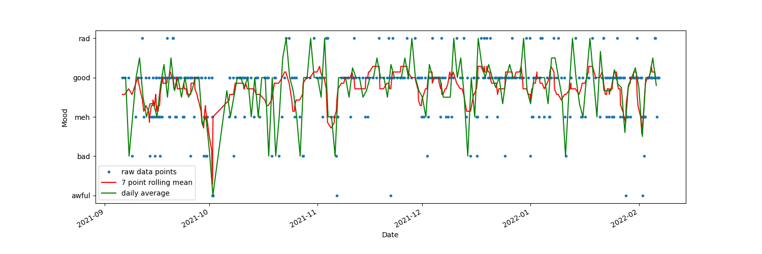
This is just made in matplotlib using pandas to aggregate the data into 7 point rolling means and daily averages.
Version 2:
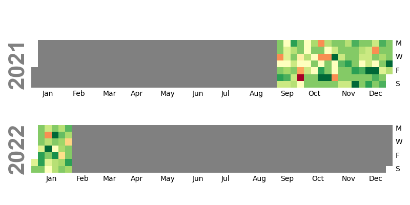
Here I used the Python package calmap to visualize the data as a calendar heatmap. The red points are the lowest,
yellow are medium, and green are the highest. I’m not sure that I love the colormap,
but I can experiment with that some more.
I’ve been reading Emotional: How feelings shape our thinking by Leonard Mlodinow. I’ve found it fascinating as I try to understand these plots and my emotions in general. It seems that I’m measuring the valence (aka the negativity or positivity) of something called “core affect.” I’m curious how I can use this data in an interventional sense to improve my life.
Once I finish the book and make some more plots, I’d like to maybe write a Medium post about all this. (That would be my first Medium post ever! It might get more attention than my little blog here.) I believe people in the Quantified Self community would find it interesting.
comments powered by Disqus